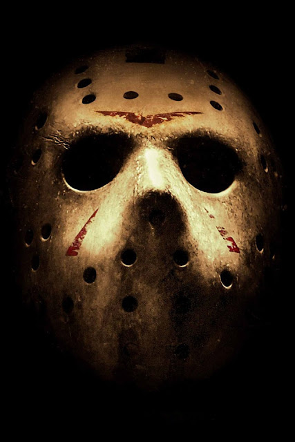
Today in class, while searching the web for inspiration on movie posters, I stumbled across a poster for the film 'Mirrors.' This shows a closeup of a girls face with emphasis on her eyes. I felt that this type of style would cater towards the style of or production also as our film is named 'Inferus' (Latin for faceless) This gave us the idea of casting the antagonists mask as the close up shot of our poster and the main focal point of the page. I felt this was a good idea as the mask from the antagonist of our film acts as a metaphor for the unknown, and a lack of emotion/empathy. This would coincide with the films 'Inferus' title. We have also been working on a custom font to accompany the image. This will we uploaded at a later date.
Here is an image taken today that resembles the above image for our poster design. We used the conventional horror conventions of low lighting and high light beamed across the face. This is used to further emphasis and intensify the main image in attempt to further capture the audiences attention.
1.1
Here is one of the first draft images we took of the mask without the low light condions and the lighting effect. This clearly shows the contrast and effects of the final draft above (1.1)
1.2
Below is an image from friday 13th poster, and as you can see, our mask, lighting and filter style match the codes and conventions seen in both the Mirrors poster and jason in Friday 13th.


No comments:
Post a Comment