Powered By Blogger

Friday 19 April 2013

New Media Technologies | Final Evaluation Question

The final question for our evaluation was done through a magazine article
in a double page spread. Due to the some errors reading the text, i had to enhance the size of the
text. I encountered this problem, assuming that the document will be readable because the real size of the double spread was in a fact, the size of a double page spread.


[CURRENTLY TESTING] seeing that the text is still small, 
i'm going to see if i can increase the size of the text a bit 
more without altering the magazine layout.


In what ways does your media product use, develop or challenge forms and conventions of real media products?

How effective is the combination of your main product and ancillary texts?

Friday 22 March 2013

Magazine Cover | COMPLETE!

Although the deadline is a little late, finally the magazine cover is complete. With our antagonist character consuming the page, we've also included other elements which relate to the horror genre. The tweaking and updating took a lot of hard work, mostly for the main photograph since the quality kept down grading, furthermore trying to force the magazine title behind our antagonists head. This involved constant tutorial searches on the internet, primarily on how inDesign works in synergy with Photoshop and Illustrator. It turned out, we had to save the photo as a PDF file, after deleting the black background we didn't need around his head. After bypassing that obstacle, the next was to work on the text and typography. We all weren't as used to Adobe Indesign compared to Photoshop and Illustrator, so we all had to quickly learn how to work it to our needs. We learned a few new things about the software, specifically how and when to use the tool Edit/Place to import photos and images. We also learned about image qualities, and how it is manipulated by the press of a button. The main problem we faced with InDesign was the 'links' and how images are primarily not in focus because they lost the link to its file. There were so many obstacles, but we managed to over come them all to create a convincing magazine cover. Our choices of layout, type and colour came from a specific cover of empire magazine. The image is displayed below:


Our final magazine cover:

Friday 15 March 2013

15-03-2013

Today we have started our evaluation questions however we are still working on our magazine! This is because we are trying out different things to make it that extra bit better!

We have also delegated different evaluation questions and have decided how we will tackle them. With the poster complete and the trailer pretty much there, the magazine is the last thing to do which will be done by next week. (Well we hope so)!

Friday 8 March 2013

SLOGANS! + Completed Poster

So we finally managed to get the poster done today. After some last minute alterations to the original image, fixing the blur effect and sorting out the size, we inserted the appropriate text needed to make the poster look more like a real film poster. The image below consists of the first draft completed poster.

(Poster Draft 1)

The next piece is our final completed poster. The only alterations done, was the slogan we had. Looking at our previous slogan, 'No identity. No remorse. No hope,' we all thought that it was kinder basic, and common. So we mind mapped our movie, picked out certain elements and went with 'The legend exists', because our movie is in fact based off the legend of Slenderman, and that the legend, DOES actually exist in or films world. 

(Final Poster)

Magazine Draft 1


This is our first draft for our magazine. We have called our magazine Take as in what the director says after filming a scene to fit in with the cinema theme. We have put in a qr code and barcode to make it more realistic as what you would get in a normal magazine in circulation. We have also added more topics on the front cover other than the film itself to make it more topical like the top 10 horror characters to fit in with the horror genre.

What we plan to do next is add the title for the movie and put it in the middle and then add more words like the magazine slogan and make it focused more towards our film in general.  

Tuesday 5 March 2013

Horror trailer 1st draft


After hours of deliberation we've finally arrived with the concluding product of our horror trailer. However the final edition of the trailer may be altered and due to change with the pending results of audience feedback.

Friday 1 March 2013

Magazine Update


After many attempts to try and get this picture perfect for our magazine front cover we have given up on it (insert sad face). Due to the busy background of trees and branches, we have found it difficult to find the right editing that would make the writing on the magazine stand out so we have changed the picture.


This is the photo that we now want to use as the background. Although dark, it is easier to work with and put writing and the title on due to the fact it would stand out better. This is because with the other photo, the writing was near enough impossible to read because of the branches and trees getting in the way!


Radial Blur Tool | Photoshop

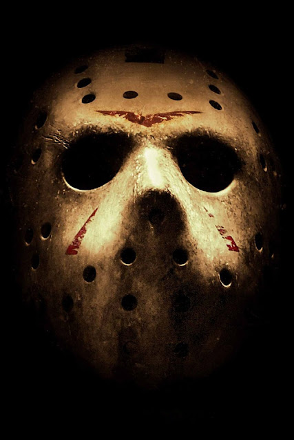
Last week in one of my graphics sessions, we learned about the various blur tools that Photoshop CS6 offered. There are so many, for example Box Blur, Gaussian Blue, Lens Blur, but the one that caught our attention was the Radial Blur tool. This enables a very dynamic view and intense view upon the image, and we thought we'd test it out on the mask image we've decided to use in for the main teaser poster.

(Test)

Tip of the Iceberg

Well, new month, new term (sort of) and its time to get started on the evaluation... that is, until we complete the Poster and Magazine cover in time! Now that Matt has completed the editing on the trailer, and is ready to upload, Alice and Sam are going to focus today finishing off what needs to be done. Since Matt is unable to attend today's lesson due to an illness, we have sent him via text some evaluation questions to complete whilst he is at home. All the work is fairly split between our group now which is group, though its not promising we'll be able to complete the magazine cover in time, furthermore get opinions and feedback on all of the work we have done. We can do this by posting on facebook, or tumblr to see if anyone responds... if not, then we'll need to do it the old fashioned way and get written notes from friends depicting their opinions on it.

We're truly on the tip of the iceberg at this time, and we've only got four more lessons until EVERYTHING must be completed and swept off the table. After that, revision of the exam begins, and so we haven't got much time. We need to get our working hats on!
Anyways today, Alice hopes to sort out and complete the film poster, whilst sort out the image with Sam for the Magazine. That'll get most of the work done and sorted, and so by this time next week, we'll be able to complete the magazine and get started on the Evaluation, which i think wont take as much time as the production stage were at now.

Friday 15 February 2013

Splatter Blood Effect


Here is the splatter blood effect that we will use for our magazine.

Poster Test(s)

Since we liked the whole threshold look of the Mask image tests, we went forward with it and wanted to see what it'll look like as an overall poster. Using our specially made title, we threw that in, along with some jibberish text below it (to create a more realistic movie poster effect) and in the end, it turned out quite not as bad as we thought it would. 


Although the outlook turned out pretty good, we're still not entirely dependent on this design for we want to see what the other photo manipulation images of the mask would look on it. I guess we chose the threshold look first because we're all mentioned that we prefer bold and simple. The poster almost looks like a real print design, you know, almost a brand which is good thing. Maybe this type of image can be used for other stuff such as Meme's, international posters or maybe just the average comic (if there was one). We're gonna move on to some more testing now, and hopefully come out with a better poster design and layout. We still want to see what the poster will look in the landscape look which is till need to sort out. 

Poster Photo Tests

Taking the photo that we uploaded two weeks ago, we played around with Photoshops basic photo manipulation tools, and we came up with various great examples we can use for the poster. Now before we even did any of this, we assumed that the poster will be of portrait view. We've got an idea for a landscape view though, but we'll come to that later after these example uploads. 

[TEST 1]
Threshold Tool

 [TEST 2]
Curve Tool + Hue

 [TEST 3]
Hue and Saturation

 [TEST 4]
Hue and Saturation + Exposure

We really like the threshold experimentation, for its bold and mysterious, plus it'll give me the chance to play around with other images and merge them into the mask shape. We're not sure yet so we'll have to wait and see. We played around with other tools though. With the Hue and saturation, we wanted a little colour 'Red' in the image, thus symbolising blood and danger, and in the end, the image turned out just as good as the threshold image. In the end, every test and manipulation tuned out really great, so now we have to decide which design is the best. We wanna try another mask photo though, particularly one at a different angle (maybe an angle facing straight on with the mask instead of looking upward to give off a an intense taunting reaction). 

Fifteenth/Two/Twenty-Thirteen

Alrighty then, lots of to be done, lots to be evaluated. So many tasks to do, so little time... but we'll manage to do it. Everything is sort of at a slow pace at the moment. Its time to update you of whats going on and how our project is coming along.
 
The production of the trailer is at a stand still at the moment. Most of it has been edited and done thanks to Matt before we even started this term, however sound and further editing must be established. We noticed all together that the recorded volume and voices of the actually actors was not loud enough, so we suggested this. We split the sound from the actual footage itself, insert specially created music over the footage, re-boot the actual voice sounds (with higher volume and intensity) and place that on the very top of the footage, like an all media sandwich. This will make the voices stand out, along with some intense and thrilling music to cover the mood and genre of the trailer. we want this trailer to be perfect, but in the order to this, we need to sort out our groups connection with the files and footage. Matt will need to send a copy of the footage to this Media accounts email inbox, and we need to sort this sound problem out using the program 'Garageband' which i mentioned before on this blog.

Now the magazine is coming along very smoothly. Sam is working very hard to find and create the best photo to use for the front page using various tools and conventions in Photoshop. Since the software upgraded last year, Photoshop CS6 offers far more than its previous ancestors. This includes brushed, photo manipulation tools, and even better use of the Pen tool which i'm glad to hear about. In previous blog updates, we mentioned that we'll be using the title 'Take'. To me, the first draft of the magazine was \'fairly' good, but i wanted something that'll jump out at the audience. I wanted a far larger and bolder font, for example 'Arial Black' or 'Impact'. We all agreed that Sam will try more and more and he'll see what he do but for now, we can only say that the magazine will be really great! He said he was going to include references to other media texts on there also, for example Saw or Paranormal. Theres nothing wrong with a little intertextuality here and then eh?

The Poster is more or less, going on less smoothly than the magazine because finding the right photo (that follows a high quality format) is just plain annoying. BUT, were not giving up! Two weeks ago, Matt took a few new photos o the 'slender' mask in the dark, along with light variations and darkness to create a eery and mighty effect towards the mask. He updated a photo on a previous blog entry if you remember, and hopefully today, i'm going to play around with this photo and try to make a good a movie poster. Matt is not here today which is a shame, so he cant supply us with the images, so the one on this blog will have to do. Good news is, is that i've completed the specially made 'Title' of INFERUS, which is ready for the poster, so hopefully now it just needs a good photo, layout and content text.

Truthfully, we're running behind work schedule, and we're worried that we wont finish all of these tasks in time ready for the evaluation. This is the very last lesson before half term, and were running out of time! Tick tock tick tock, and no, thats no 'Hugo' reference there. We have all agreed to continue this over the half term . What we do want to do is finally finish this trailer, so we have contacted Matt about sending the footage to us, so we can sort out this damn sound problem. But for right now, its time to experiment with poster conventions, and see how this image turns out. Blog entry out.

Friday 8 February 2013

2nd Lesson Into February

Today we continued with our trailer and magazine front cover and has been quite successful! We have finally managed to get the right picture for the magazine front cover of which is below on the blog. The trailer is also coming along a treat as we getting to grips with what exactly will be in the trailer and for how long it will be within the 1 minute 10 second timeframe. Blog out

Magazine Cover Draft 4


Here is the final copy of our background picture for our magazine. In order to do this we had to play around with the gradients, exposure and contrast settings.


Here is the view of photoshop that we had whilst doing it.

We decided not to go with the blur effect because it just wasn't working out with what we wanted as it didn't fit in with our final picture. The reason why we decide for this photo is the fact that it is quite dark and mysterious due to the effects that we have given it. In particular the mask stands out for being light but really dark at the same time fitting in with the horror theme.

Magazine Picture Update


We have decided to go with the original photo instead of the edited one because we felt we had more to work with rater than a blank white canvas. We will see what we can do with it as we intend to either blur or sharpen the image.

Magazine Draft 3


Here's our second draft for our magazine. We have decided to try out blurring the picture to see if it adds a 'better' looking effect. From what we can see, we are thing about making the blur effect a bit more rounded instead of it being pointed and to perhaps make the mask a bit blurred to add to the mystery of who he is.

Friday 1 February 2013

Third Lesson of 2013

In todays lesson we got quite a bit done as we continued with our poster and magazine. We took a few photos of our mask for our poster. To do this we used a torch and put it under the table and took a low angle shot and it turned out really well if I say so myself! We also started to experiment with different gradients and background colours for our magazine.

We also continued trying out different names for our magazine and have decided to add the character from Saw, Billy The Puppet to add to the horror feel of our magazine. We have also completed the title for the film of which we have spent a while doing!  
Here is the second draft of our magazine front cover. We have inserted the image of Billy The Puppet but the positioning of it is still up for debate and further change if need be. We will also refine the main image of the antagonist to make it a bit clearer as it's a tad blurry. The title "Take" font will also be changed.

Poster design


Today in class, while searching the web for inspiration on movie posters, I stumbled across a poster for the film 'Mirrors.' This shows a closeup of a girls face with emphasis on her eyes. I felt that this type of style would cater towards the style of or production also as our film is named 'Inferus' (Latin for faceless) This gave us the idea of casting the antagonists mask as the close up shot of our poster and the main focal point of the page. I felt this was a good idea as the mask from the antagonist of our film acts as a metaphor for the unknown, and a lack of emotion/empathy. This would coincide with the films 'Inferus' title. We have also been working on a custom font to accompany the image. This will we uploaded at a later date.

Here is an image taken today that resembles the above image for our poster design. We used the conventional horror conventions of low lighting and high light beamed across the face. This is used to further emphasis and intensify the main image in attempt to further capture the audiences attention.

1.1


Here is one of the first draft images we took of the mask without the low light condions and the lighting effect. This clearly shows the contrast and effects of the final draft above (1.1)

1.2


Below is an image from friday 13th poster, and as you can see, our mask, lighting and filter style match the codes and conventions seen in both the Mirrors poster and jason in Friday 13th.


Magazine Development

We have decided to call our magazine "Take". We have decided to use this title because it is a film term meaning it is unedited footage in one take. It will cater to a niche audience because the horror genre isn't for everyone and does attract a certain type of person looking for a thrill. We have also decided to put a picture of Billy the Puppet from Saw on the front cover to further highlight that it is a horror magazine and because he is an iconic horror character through his involvement in the Saw franchise.

Here is the picture of Billy The Puppet that we will use.

Friday 25 January 2013

Second Lesson of 2013

Today was the first lesson for two weeks due to last weeks lesson being cancelled due to the snow. We continued on our magazine, poster and trailer editing and got a better glimpse of how our poster and magazine would turn out like. We researched past Empire magazine covers to get a feel for what types and how they are laid out and we have decided to go with a magazine cover very similar to the Django Unchained issue due to it's dark, simple yet mysterious front cover. The lack of writing adds to this mysterious allure and that would fit in perfectly with the horror narrative.

First Magazine Front Cover Draft


This is our first draft of our magazines front cover. This is the basis of what we will be doing. We will add some more text about the film and whats inside the magazine and we will be making the background darker to fit in with the horror genre. We will also be changing the colour of the title.

Risk assessment form.

This magazine cover from Empire is the magazine cover I'm going to base mine around. It's dark and to the point. There is a dark background and the use of a gun pointing at the reader shows what type of film it is, an action thriller.


Here's the photo that we will use for our magazine cover. It's very similar to the Django Unchained cover where there is just the character and a little bit of writing. The majority of it is also dark and makes the reader uneasy and curious to find out what the film is about. This fits in really well with the horror narrative as a result of this mysterious air to it.  


Friday 11 January 2013

First Lesson of 2013

Today was our first lesson since last filming the final parts of our trailer. We all looked at the footage and the initial editing that Matt had started which was very good. We debated how and what to do next to make it even better and thrashed some ideas about. We started to add more of a description to our photos on the right tab of the blog about why we took them and what we like about them.

We have also started the magazine cover and poster and getting used to the software like photoshop that we're using to put them together. We have also decided to bring in the mask next week and to take more photos of it and then edit it into our trailer and poster to make it our antagonist more of a mystery, that will also add suspense.